ODDO BHF
Brand creation for the fusion of ODDO (France) and BHF (Germany) Banks
CBA PARIS / Creative Director
Team: Pierre Rhodes, Noe Halimi, Yovanna Wallet Photography: Matthias Haslauer
The creation of the new ODDO BHF Group is rooted in a Franco-German dynamic. It was important to mark this major step by developing the name, logo, and slogan of the group, both in France and Germany, while remaining faithful to the character and history of each of the companies, which were founded more than 150 years ago.
The base for the new logo is the idea of the union between the companies,
their prospects, and pathways, as well as tradition and the future.
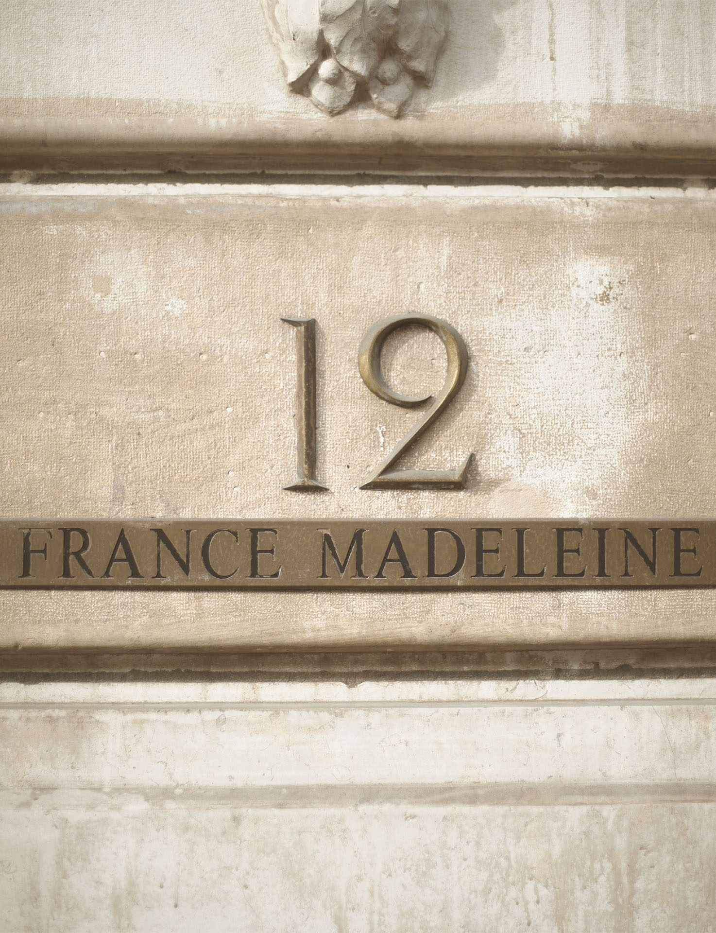
The acquisition of BHF-Bank turned ODDO BHF into the largest privately-owned bank in the eurozone
Stage 1: Comprehend cultural diversity
To analyse the status quo of the two privately owned banks, more than fifty interviews were conducted. This included employees of all levels of seniority as well as a number of French and German clients. The bicultural context of the merger, made this stage especially important to understand differences and expectations.
The Group’s new personality was formed on common traits found in both banks: passionate, elegant, inventive, reliable and diverse. The inclusion of a sociologist who is an expert in both cultures deemed especially helpful for this bicultural project to understand and overcome the cultural challenges.
Stage 2: Unite and set the direction
The heritage of each of the banks reached back as far as 150 years. Clients often belonged to the bank for generations and employees were attached to the banks name which was viewed as prestigious.
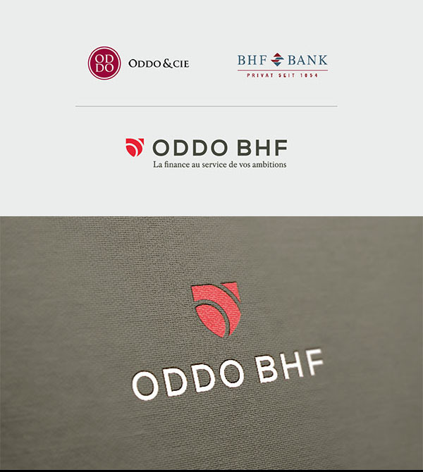
The analyses of the previous stage clearly indicated that combining the two names would be a powerful lever for uniting employees and re-assure clients: the new ODDO BHF Group has a French-German identity and will embody both entities.
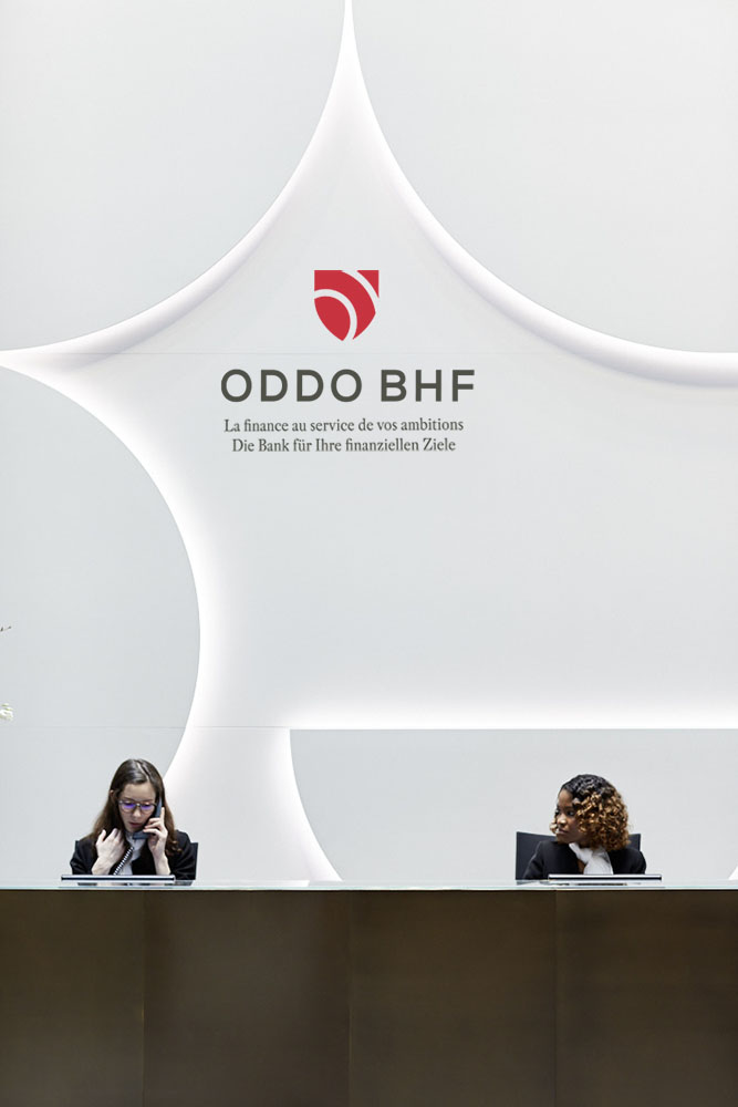
The new identity and slogan conveys the new positioning while remaining faithful to the character and history of each organisation. The slogan was crafted in 3 languages to convey a refreshed vision of finance -
‘La finance au service de vos ambitions’
Die Bank für Ihre finanziellen Ziele
Make finance work for you
Stage 3: manifest the change
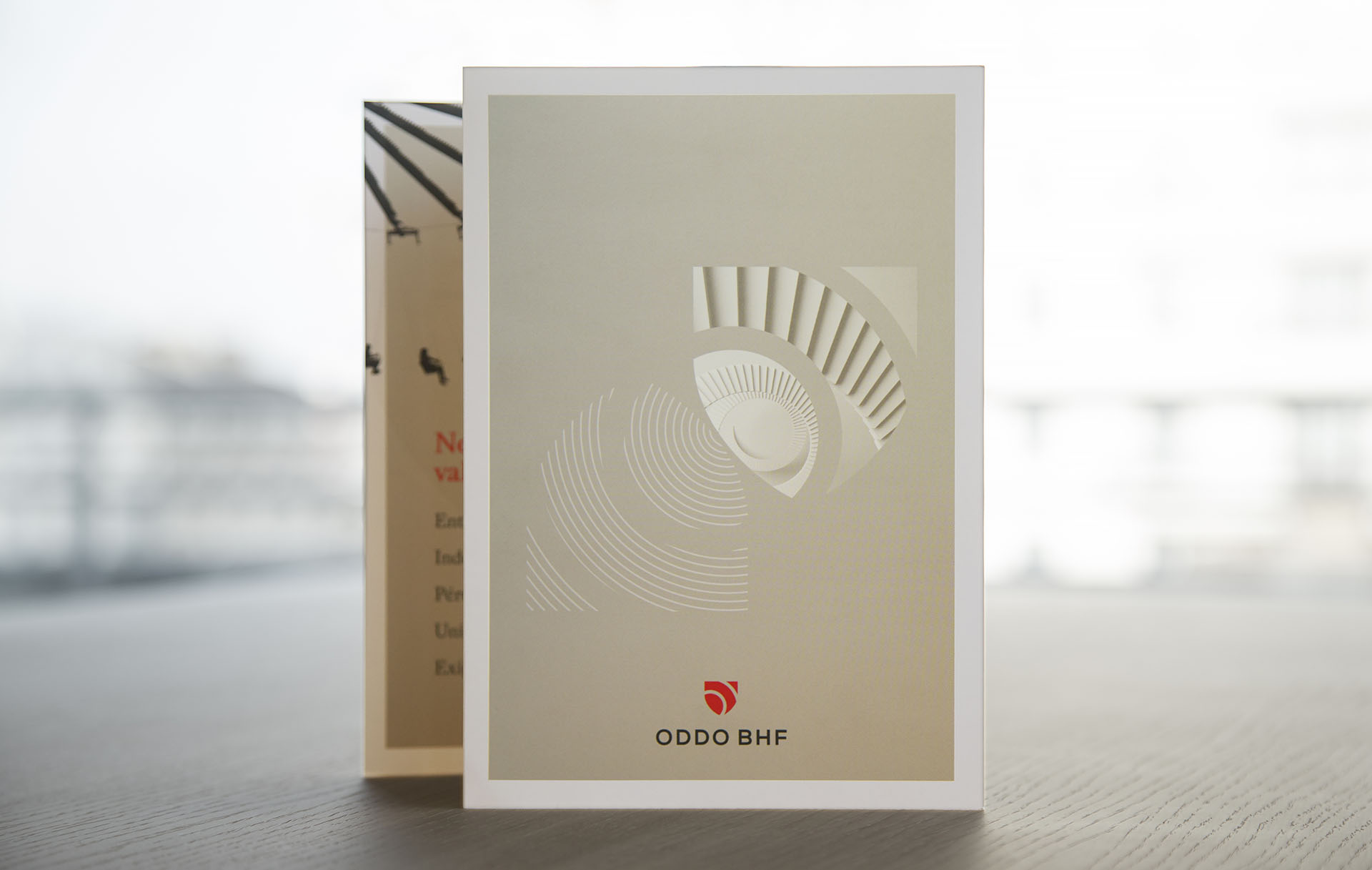
To give tangible form to the new endeauvor, the creative team started the work on the new corporate identity. Ideas around the union and pathways of two entities were explored.
As a symbol of tradition and protection, the shield stood quickly out as a creative direction to explore and follow. The idea to have two circles inside the shield, representing the letters O and B, re-injected dynamism.

Stage 4: Launch and support the change
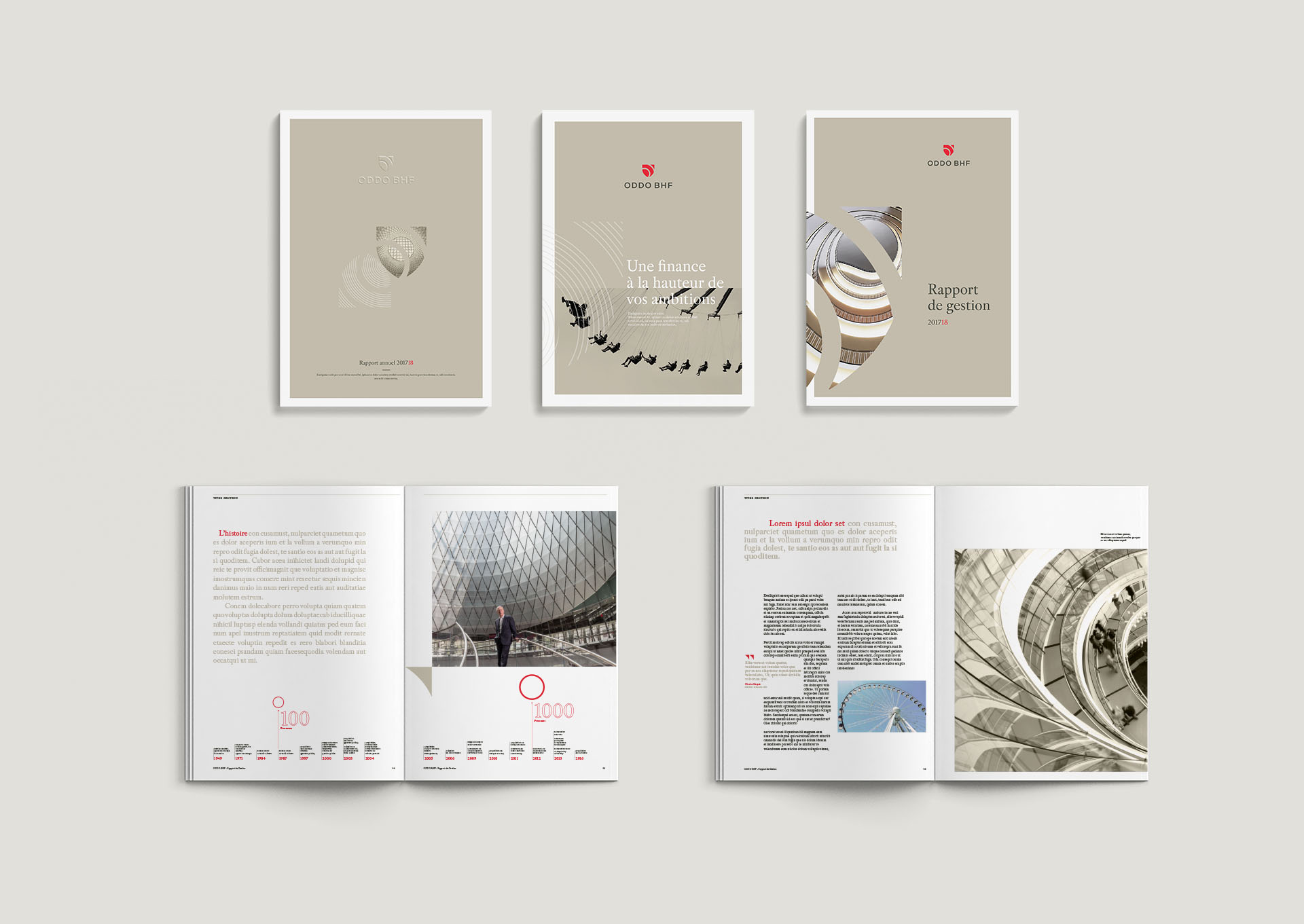
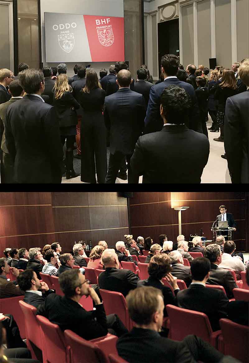
As the beginning of a series of launch events, the new identity of ODDO BHF was revealed to the employees.
After the initial presentation of the new logo, workshops were held to illustrate and explain the decisions that led to the new personality and identity of ODDO BHF.
These workshops helped to create ownership and to have open discussions about the perception of the new identity.

more projects...
RungisBranding

Honest DesignTalk
KoumkwatBranding
LeocareProject type

Institut Paul BocuseBranding
ElanBranding
Metal Shutter HousesBranding
Raise InvestmentBranding
COPYRIGHT 2020 MARTIN ISELT


